User Guide of IDEA/HELP.md
In likelet/IDEA: Interactive Differential Expression Analyzer
User Guide
Introduction
IDEA, full name as "Interactive Differential Expression Analyzer", is an online analysis and visualization platform for differential feature expression analysis of read count data on foundation of R, Shiny and JavaScript. In IDEA, five R packages, DESeq, edgeR, NOISeq, PoissonSeq and SAMseq are provided for counts data analysis.
The tips will be shown once the user moves the cursor to the charts, icons or question marks as shown in Figure 0-1 (upper) and Figure 0-2 (lower). For charts with interactive option, the option panel will appear with the chart by default, and it can be closed and reopened by clicking the gear icon as shown in Figure 0-2. Moreover, every figure shown in the page can be downloaded separately by clicking the download icon (Figure 0-2) on each figure.
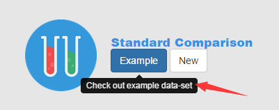
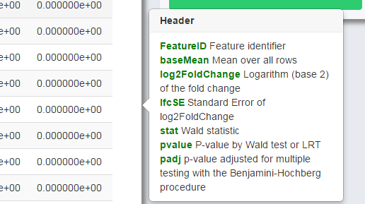
Figure 0-1 Example of tips
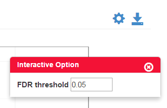
Figure 0-2 Example of interactive option
Starting a New Analysis - "New"
Counts Data and Experiment Type
In this module, users need to choose the experiment type and upload the data in specific format.
Here we provide an example dataset. By clicking Example, you will see the data information of the example. The design matrix and count matrix data of the example is available for download respectively as shown in Figure 1-2.
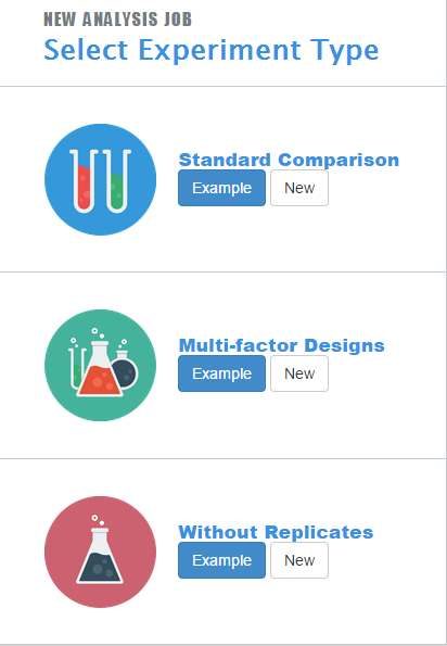
Figure 1-1 Experiment Type Select Panel
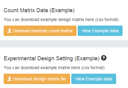
Figure 1-2 Download and view Example
For experiment types, IDEA can work with 3 kinds of experiment types: experiment with standard comparison, experiment of multi-factor design and experiment with no replicates (NOT RECOMMANED).
"Standard Comparison" supports experiments with only one factor, several conditions and several replicates (example shown in Table 1-1).
Table 1-1 Example of Standard Comparison
Conditions
Replication 1
Replication 2
Factors
Viscera
Kidney
Liver
Kidney
Liver
"Multi-factor Design" supports experiments with several factors, conditions and replicates (example shown in Table 1-2).
Table 1-2 Example of Multi-Factors Design
Factors
Replication 1
Replication 2
Conditions
Viscera
Kidney
Liver
Kidney
Liver
Sex
Female
Male
Female
Male
Without Replicates supports experiments with no biological replicates (example shown in Table 1-3). Not all methods are applicable to analyze the data without replicates, since it is necessary to assume the distribution form (negative binomial distribution or Poisson distribution) and the parameters based on empirical.
Table 1-3 Example of Without Replicates
Factors
Replication 1
Conditions
Viscera
Kidney
Liver
Sex
Female
Male
Uploading Data
Loading Read Counts Table
The data matrix should be in .csv or .txt format, with genes as row and samples as column, and upload raw counts only.
If you check the Header box, the first row and column of the matrix will be considered the header by default. For Separator, it is accessible to use either comma (,), semicolon (;) or tab (tabular). If your data has quote, choose the Quote option precisely, otherwise, choose "None".
Also, it is optional to input the "gene length file" with features names as column1 and the length as column2, the header and separator should be the same as the countable.
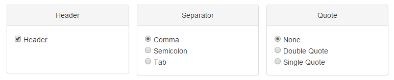
Figure 1-3 Data uploading panel
Setting Experiment Design
The conditions of the experiment should also be inputted as .csv or .txt format, and the conditions will automatically appear on the page for chosen. For multi-condition experiment, choose only two compared conditions to call differential expression features, or by default, the first two conditions will be chosen as the compared conditions. In Multi-factor Design, factor of interest is set as the first column of your design matrix.
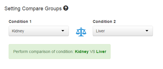
Figure 1-4 Setting compare groups
Previewing Data Information
By clicking "View uploaded data", the "Data Information Table" will show the uploaded read counts table. The order of the table can be changed by clicking the header of the column. The number of the features shown on each page is also changeable on the top left.
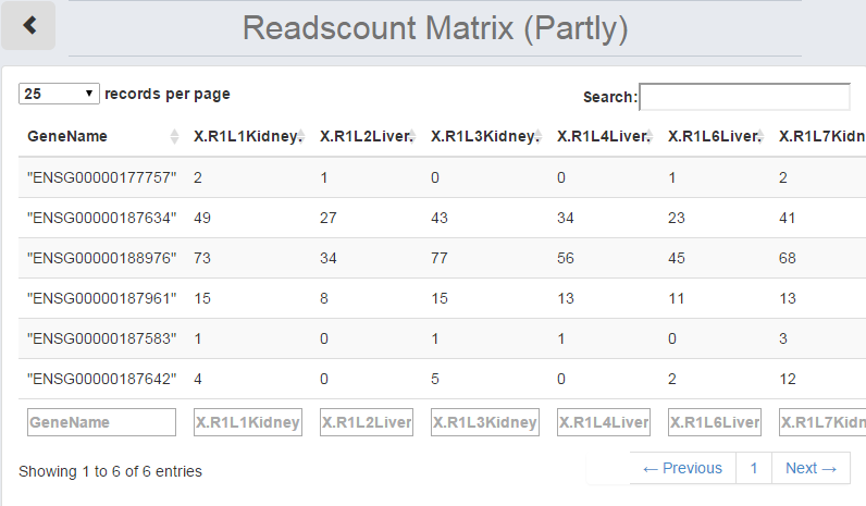
Figure 1-5 Data Information Table
Data Exploration - "Data"
Introduction
The "Data" module does the job of data normalization, data exploration and quality control.
The process of normalization attempts to settle the problem of various factors (nucleotide composition of features, library preparation and sequencing platform etc.) which can bring bias into number of reads in read count data. 3 methods are provided to normalize sample data (Table 2-1).
Table 2-1 Normalization Method
| Abbreviation | Full Name | Method Details |
| :----------: | :-----------------------------------: | :----------------------------------------------------------: |
| RPKM | Reads Per Kilo Base per Million Reads | Divide gene count by the total number of reads in each library or mapped reads |
| UQ | Upper Quartile | Sum gene counts up to the upper 25% quartile to normalize |
| TMM | Trimmed Mean of M | Compute a scaling factor as weighted means of log ratios between two experiments after excluding most expressed and genes that have large log ratios in expression |
Parameter Settings
Choose the normalization method on the panel before doing anything else. If normalization is unnecessary, choose "None".As default, the Upper Quartile method is chosen.
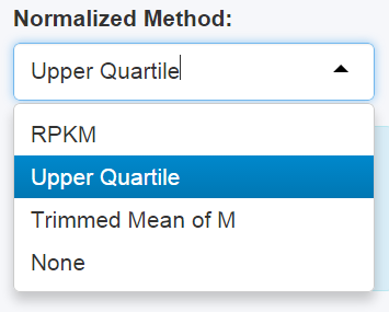
Figure 2-1 Normalization Panel
Customizing Charts
Different figures and tables may have specific settings. See more options and instructions in particular charts, such as Stacked Density Plot, Heat Map of Sample Distance or Correlation Analysis.
Charts and Plots
See more instructions of charts and details in Report.
Data Distribution
Sample Boxplot
Samples boxplot visualizes count distribution for all samples, showing features in expression distribution in each sample.
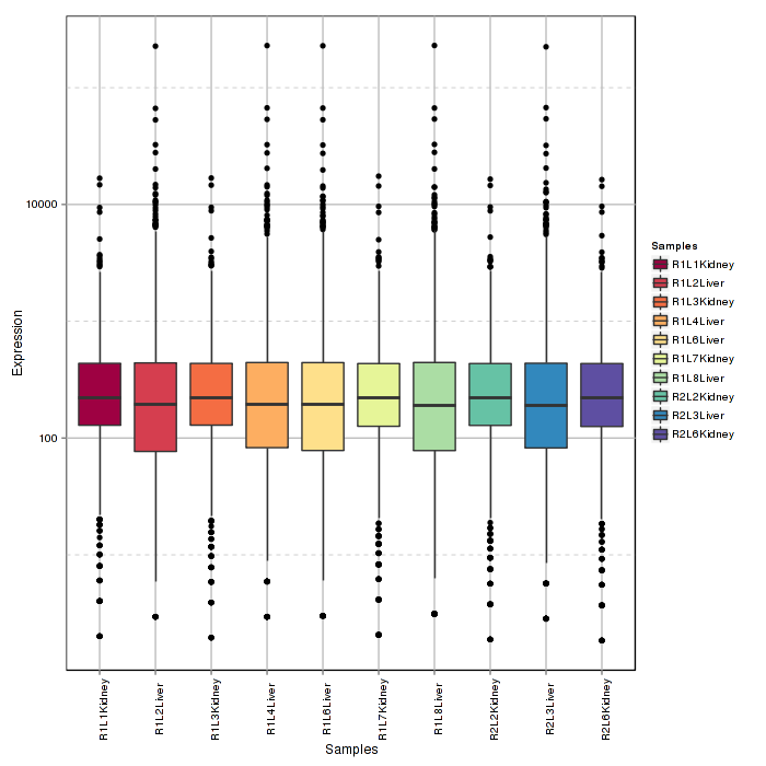
Figure 2-2 Sample boxplot
Stacked Density Plot
Stacked density plot visualizes density distribution of features with different read counts, showing overall condition of read counts data normalized counts. For interactive option, click the input box to add the samples and click Submit to plot, delete the samples by clicking the cross near the sample.
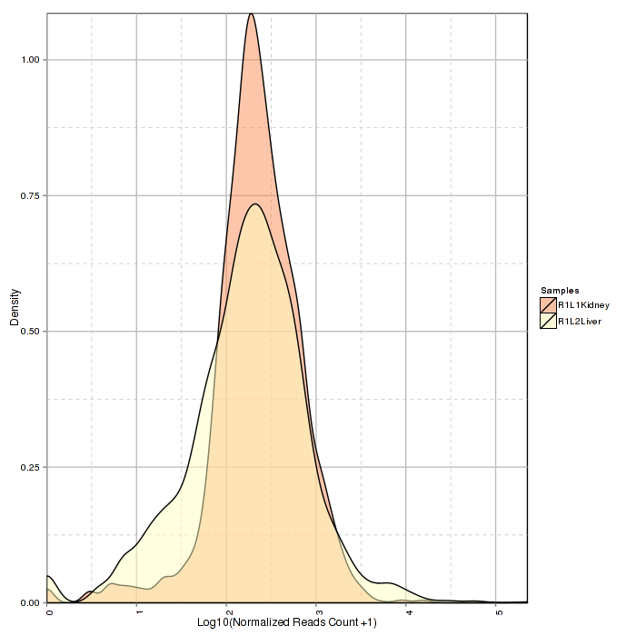
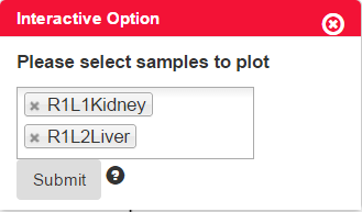
Figure 2-3 Stacked density plot and interactive option
Ratio Bar Plot
Ratio bar plot visualizes distribution of counts in each samples using stacked bar. Low counts may introduce noise and interfere extraction of differential expression of features.
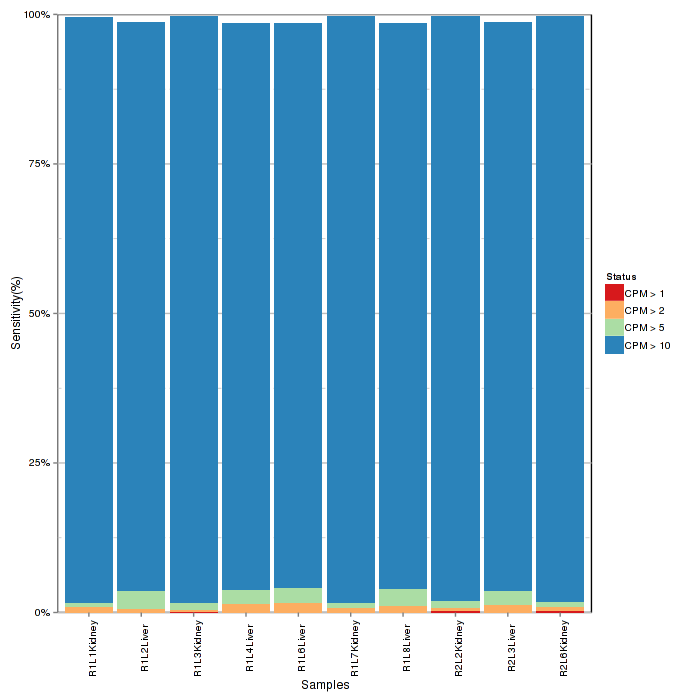
Figure 2-4 Ratio bar plot
Sample Distance
Heatmap of Sample Distance
The heat map of sample distance visualizes the Euclidean distance between the samples, giving an overview of similarities of sample heat map. The heat map color can be changed in interactive option. Attention, if the samples have a clear classification, this plot may only have two colors, as shown in Figure 2-5.
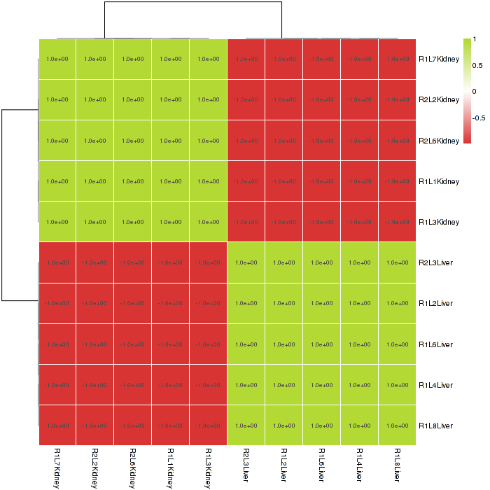
Figure 2-5 Heat map of sample distance and interactive option
Principal Component Analysis
A principal component analysis (PCA) plot visualizes the affection of the first two principal components. It is optional to show the labels of data in the figure on the interactive option panel.
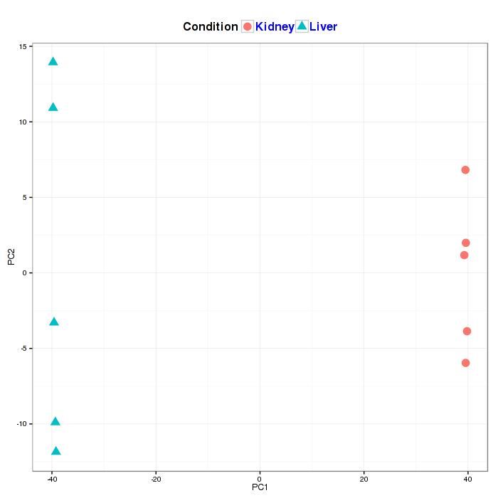
Figure2-6 Principal component analysis plot and interactive option
Corrrelation Analysis
With scatter plot, the correlation analysis visualizes Spearman's correlation of feature expression between two selected samples. Spearman correlation coefficient is shown in the Interactive Option panel of correlation analysis. The sample plotted on the x and y axis can also be changed on the panel.
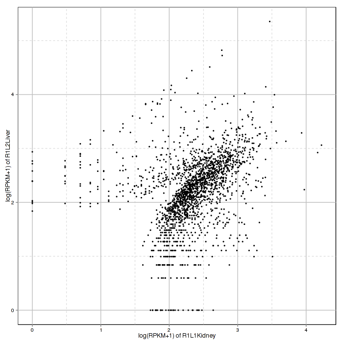
Figure 2-7 Scatter plot and correlation analysis and interactive option
Feature Query
A histogram with error bar visualizes the comparison result of expression level of a certain feature, selected by user in interactive option, in different conditions. The mean, standard deviation and standard error of the chosen feature is also shown in interactive option panel. The Report will only show the figure of feature chosen here.
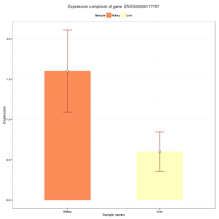
Figure 2-8 Feature query and interactive option
Download Report
The normalized data in .csv format and the report of all charts can be downloaded on the panel.

Figure 2-9 Download panel in "Data" module
Differential Expression Feature Analysis - "Analysis"
Introduction of "Analysis"
The "Analysis" module is divided into two parts: the packages analysis part and the combination part. In packages analysis part, we provide five methods for analyzing differential expression of features. Here we simply introduce the basic feature of every method. The summary table is given below (Table 3-1).
Table 3-1 Summary of packages
| Package | Version | Normalization (default) | Model of Reads Count Distribution | Differential Expression Test | FDR Control | Standard Comparison | Multi-factor Design | Without Replicates |
| -------------- | ------- | ---- | ---- | ---- | :----: | :---- :| :-----------------------------------: | :---- :|
| DESeq2 | 1.6.2 | sizeFactors | Negative binomial distribution | Wald test, LRT | Benjamini-Hochberg procedure |  | | |
| edgeR | 3.8.3 | TMM | Negative binomial distribution | Fisher's exact test | Benjamini-Hochberg procedure | | | |
| NOISeq | 2.8.0 | RPKM | Nonparametric method | P-value for empirical distributions | Not applicatable | |
| | |
| edgeR | 3.8.3 | TMM | Negative binomial distribution | Fisher's exact test | Benjamini-Hochberg procedure | | | |
| NOISeq | 2.8.0 | RPKM | Nonparametric method | P-value for empirical distributions | Not applicatable | |  | |
| PoissonSeq | 1.1.2 | Goodness-of-fit estimate | Poisson distribution | Score statistics | A permutation plug-in approach | | | |
| SAMseq (samr) | 2.0 | Subsampling method | Nonparametric method | Wilcoxon test | A permutation plug-in approach | | | |
| |
| PoissonSeq | 1.1.2 | Goodness-of-fit estimate | Poisson distribution | Score statistics | A permutation plug-in approach | | | |
| SAMseq (samr) | 2.0 | Subsampling method | Nonparametric method | Wilcoxon test | A permutation plug-in approach | | | |
Setting up
Selecting Package
Be sure of your experiment type. The multi-factors design can only use DESeq2 and edger packages, the PoissonSeq or SAMseq is not available for experiment with no replicates.
Click the icon of one package and click START, the charts of this package will show on the page.
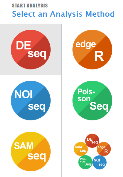
Figure 3-1 Method select panel
Advanced Settings
- The advanced option of each package is different and a simple instruction is given below.
- DEseq. The test method of differential expression features table is changeable.
- edgeR. Normalized method is changeable inside the package (see more details about these methods in "Data"-"Parameter Setting"). Two kinds of estimating dispersion methods are offer for chosen. The number of "Filter your dataset by" means only the feature reads above this number are counted in the analysis. FDR threshold is the false discovery rate threshold.
- NOISeq. Normalized method is changeable.
- PoissonSeq. None.
- SAMseq. The two advanced option in SAMseq are all for differential expression analysis table.
Charts and Plots
Different packages have different visualization. Table 3-2 is a summary of charts in different packages.
Table 3-2 Summary of types of charts and plots in packages
| Chart/Plot Type | DESeq | edgeR | NOISeq | PoissonSeq | SAMseq |
|:-:|:-:|:-:|:-:|:-:|:-:|
| Differerential Expression | | | | | |
| Features Table | | | | | |
| MA-Plot | | | | | |
| Normalized SizeFactors | | | | | |
| Volcano Plot | | | | | |
| Heat Map | | | | | |
| FDR/P-value/Probabiltiy | | | | | |
| Distribution | | | | | |
| Variance Estimation | | | | | |
| Power Transformation Curve | | | | | |
| Q-Q Plot | | | | | |
See more instructions of charts and details in Report.
Differential Features Table (All Packages)
The order of the table may changed by clicking any names on the first line. The number of features shown in one page can be changed on top left. The search function can search the data on either column.
The interpretation of the columns in all packages is shown in the table below.
Table 3-3 Interpretation of differential features table in all packages
PackageHeaderInterpretationDESeqFeatureIDFeature identifierbaseMeanMean over all rowslog2FoldChangeLogarithm (base 2) of the fold changelfcSEStandard Error of log2(FoldChange)statWald statistic / LRT statisticpvalueWald test/LRT p-valuepadjp-value adjusted for multiple testing with the Benjamini-Hochberg procedureedgeRFeatureIDFeature identifierlogFCLogarithm (base 2) of the fold changelogCPMAverage log2-counts-per-millionPValueTwo sided p-valueFDRFalse discovery rateNOISeqFeatureIDFeature identifierMeanMean of this conditionThetaDifferential expression statisticsProbProbability of differential expressionLog2FCLogarithm (base 2) of the fold changePoissonSeqFeatureIDFeature identifierttThe score statistics of the featuresP.valuePermutation-based p-values of the featuresFDREstimated false discovery ratelogFCEstimated log (base 2) fold change of the featuresSAMseqFeatureIDFeature identifierScore.dThe T-statistic valueFold.ChangeThe ratio of the two compared valueq.valuethe lowest FDR at which that feature is called significant
MA-Plot of Differential Expressed Features (DESeq, edgeR)
In MA-Plot, the data is been transformed onto the M (fold change or log ratio) and A (average expression of a feature) scale, which can give users a quick overview of the distribution of data. The false discovery rate (FDR) threshold can be changed, and the features are colored red if the adjusted p-value is less than the FDR, while other features are colored blue.

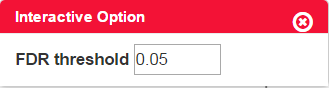
Figure 3-2 MA-plot and interactive option
Normalized Size Factors (DESeq, edgeR)
Since different samples may have different sequencing depth, it is necessary to put every count value to a common scale in order to make them comparable.
In edgeR table, group represents conditions, lib.size represents size of the library, norm.factors is the normalized size factors.
Table 3-2 Table of Normalized size factors in edgeR

Volcano Plot of Differential Expressed Features (DESeq, edgeR)
An overview of the number of differential expression features can be shown in the volcano plot. The threshold of both axes can be changed on the Interactive Option panel. Highly differential expressed features are colored blue, while others are in red.
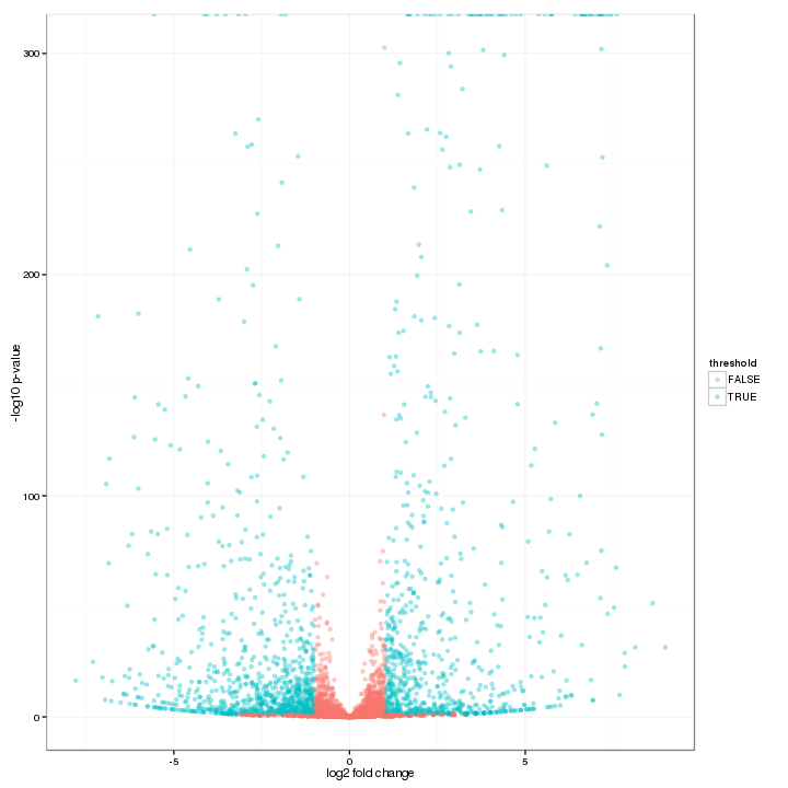
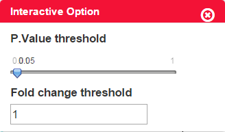
Figure 3-3 Volcano plot and interactive option
Heat Map of Differential Expressed Features (All Packages)
By using a color scale, heat map can display the expression values of the features, and every rectangle represents one feature – sample pair. By default, we display the 30 most highly expressed features and this number is changeable on the option panel. In addition, the scale method (normalize data in row or column), clusters of row /column and colorkey is also changeable on the panel.
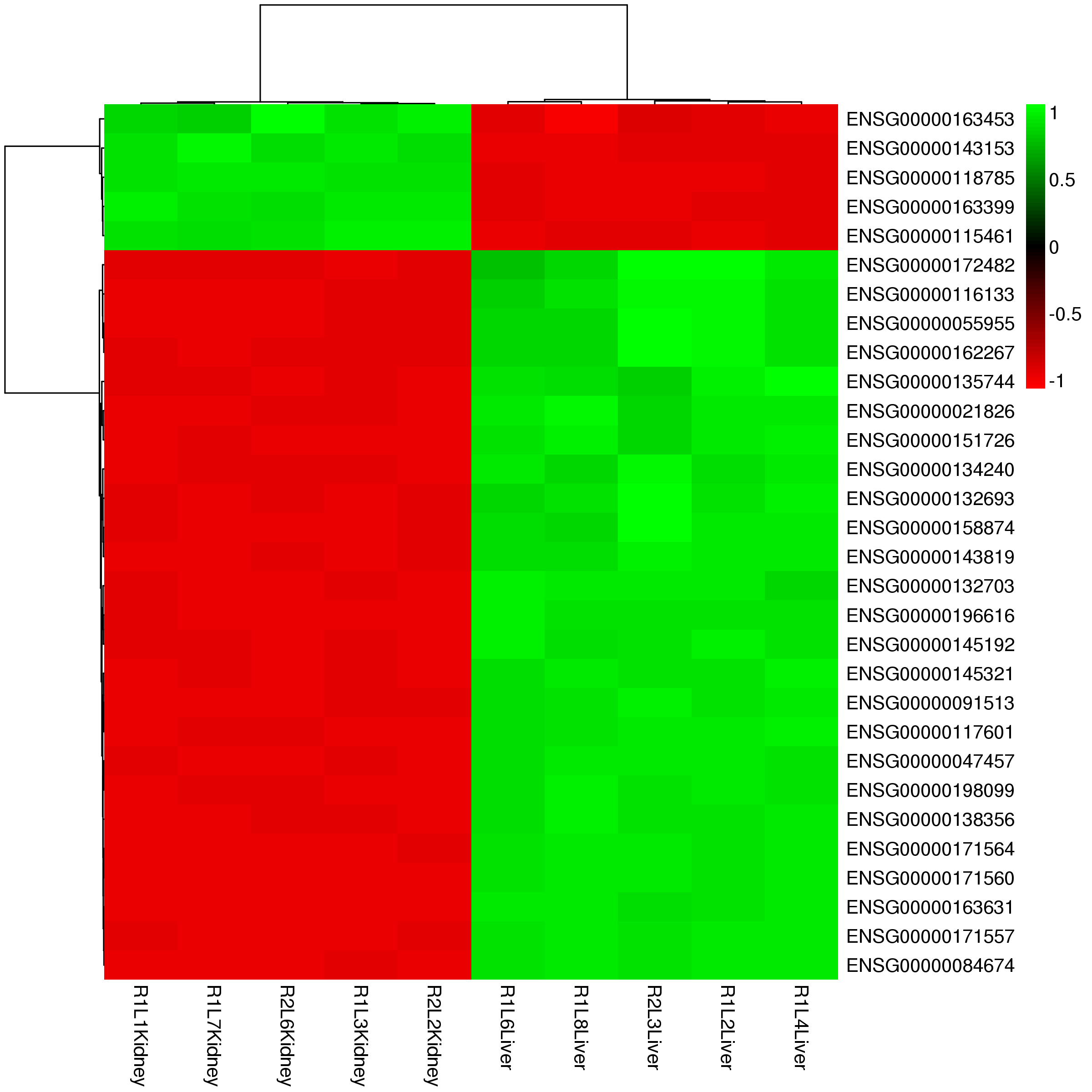
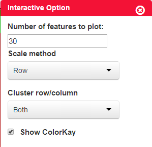
Figure 3-4 Heat map of differential expression features and interactive options
FDR/P-value/Probability Distribution Plot (All Packages)
FDR/P-value distribution plot visualizes distribution of FDR or P-value in differential expression test provided in analysis packages using histogram plot. Specially, NOISeq uses the q-value (standard comparison) or prob(without replicates) to form the distribution plot.
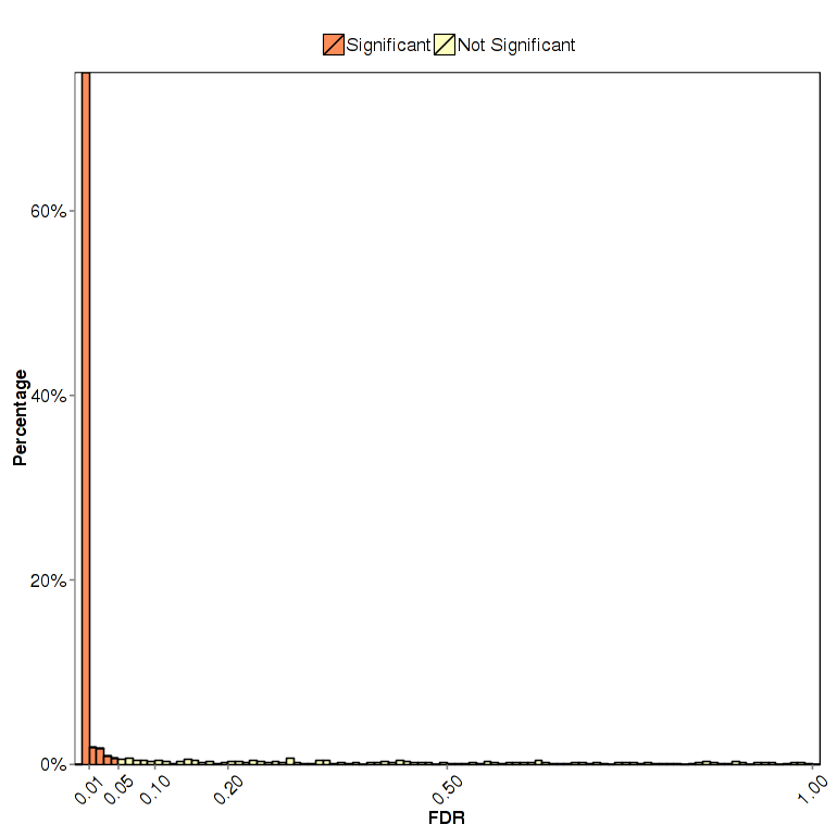
Figure 3-5 FDR distribution plot
Variance Estimation (DESeq)
The dispersion estimates plot is for checking the result of dispersion estimates adjustment. The feature-wise estimates are in black, the fitted estimates are in red, and the final estimates are in blue. The outliers of feature-wise estimates are marked with blue circles. The points lying on the bottom indicates they have a dispersion of practically zero or exactly zero.
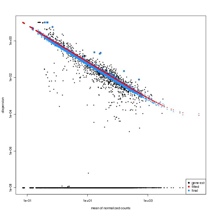
Figure 3-6 Dispersion estimates plot
Variance estimation (edgeR)
The variance estimation plot has average log CPM (counts per million) as x-axis and biological coefficient variation as y-axis. The red dots represent the common dispersion and the black dots represent the tag-wise (feature-wise) dispersion.
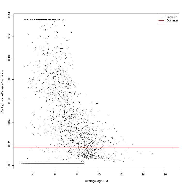
Figure 3-7 Variance estimation plot
Power Transformation Curve (PoissonSeq)
Power transformation curve is for estimating the best parameter for minimizing overdispersion of data. It plotted one over theta on y-axis and mean log mu on x-axis. See more details on the Report.
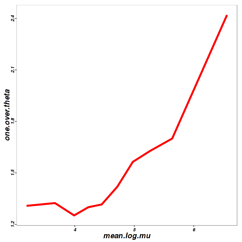
Figure 3-8 Power curve of PoissonSeq
Q-Q Plot (SAMSeq)
The Q-Q plot, also called the SAM plot in SAMseq, is a scatter plot with dots representing features. The positive significant features, which means the features has higher expression correlates with higher risk, are in red, and negative significant features are in green, while others are in black.
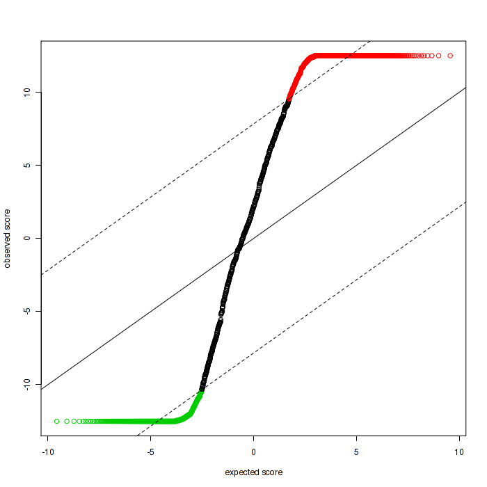
Figure 3-9 Q-Q plot in SAMseq
Download Report
The markdown files of every package are provided as the analysis report and can be downloaded on the panel. Notice that each package will generate the specific report.
Also, the differential features table (.csv format) can be downloaded separate from other charts by "Download .csv file".

Figure 3-10 Download panel in "Analysis" Module
Combination Analysis - "Combination"
Introduction of "Combination"
By clicking the icon in figure 3-11, the user will enter the "Combination" mode. "Combination" module provides a collection and comparison of the prior using packages. Figures like Venn and bar plot give an intuitive impression of the different result made by each package. We also define a new argument called R-value to synthesis the results of differential expression features from these packages.
Figure 3-11 Combination mode
Setting up
It is available for users to choose the packages needed to analysis on the "Advanced Option" panel.
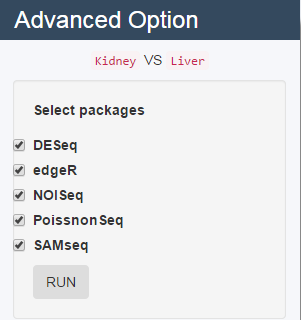
Figure 3-12 Advanced option
Charts Interpretation
Differentially Expressed Features Identified by Packages
This plot shows a comparison of the number of differential expression features identified by each package. The different of the results are caused the differences of the algorithm of these packages. The counts of features are plotted on the y-axis and each bar represents one package.
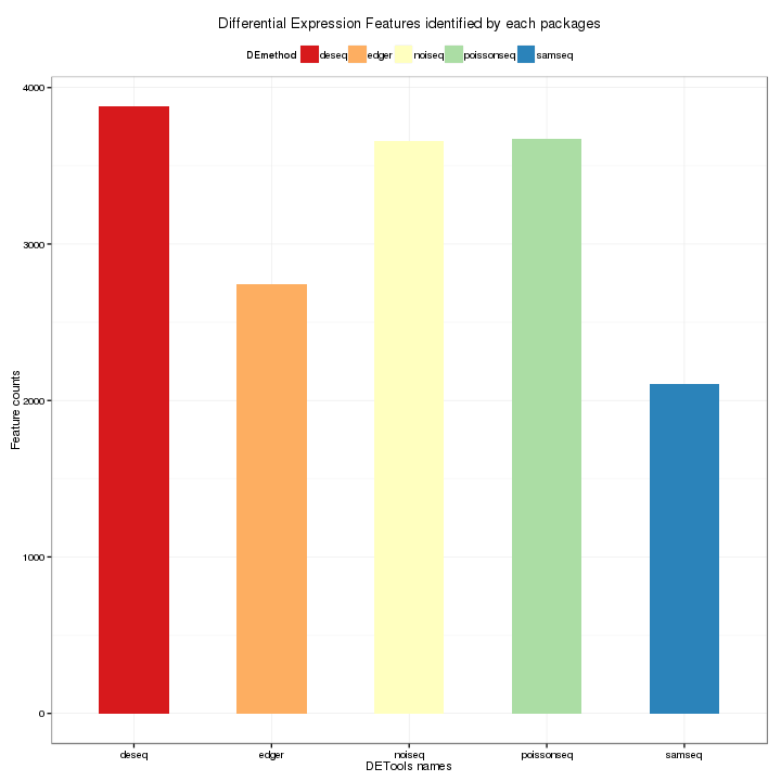
Figure 3-13 Bar Plot of total counts of features by each package
Venn of DE Features Analyzed by Packages
The Venn diagram visualizes the overlapping differential expression features identified by each package. In the diagram, each oval represents one package, and the number shown in the diagram means the number of differential expression features.
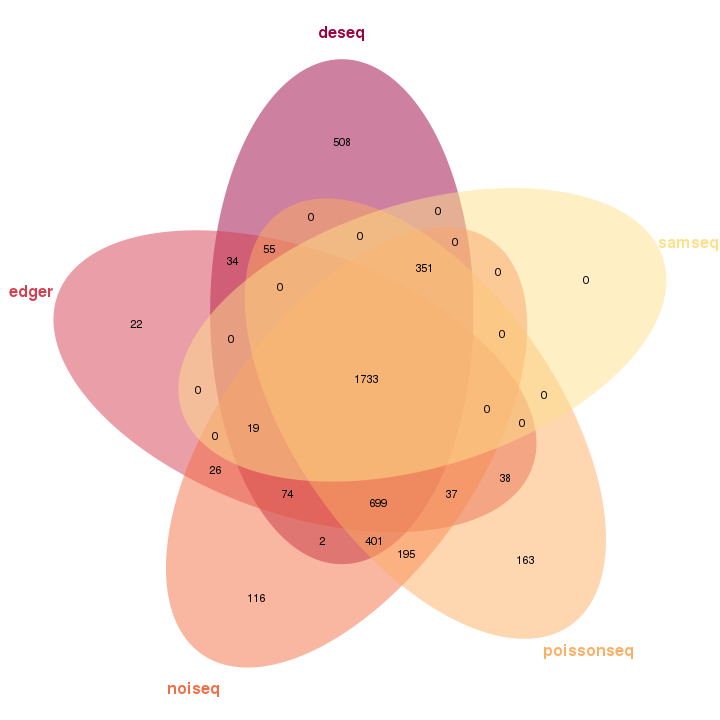
Figure 3-14 Venn plot of differential expression features analysis by each packge
Feature Weight Table
This table shows the identification details of every feature, and the order of the table may changed by clicking any names on the first line. The number of features shown in one page can be changed on top left.
The interpretation of some columns is shown in the table.
Table 4-1 Interpretation of feature weight table
| Package | Header |
| :-------: | ------ |
| FeatureID | Feature identifier |
| Mean | Mean of expression |
| LogFC | Logarithm of the fold change |
| Rankmean | Mean rank of the five packages |
| Score | Intergration score of rank lists of DE features by robust rank aggregation (RRA) |
Download Report
As other modules, the report of "Combination" is also available for download. The .csv format result is the result of the "Feature Weight Table".

Figure 3-15 Download Panel
likelet/IDEA documentation built on Sept. 8, 2020, 2:56 p.m.
R Package Documentation
Browse R Packages
We want your feedback!
Note that we can't provide technical support on individual packages. You should contact the package authors for that.
User Guide
Introduction
IDEA, full name as "Interactive Differential Expression Analyzer", is an online analysis and visualization platform for differential feature expression analysis of read count data on foundation of R, Shiny and JavaScript. In IDEA, five R packages, DESeq, edgeR, NOISeq, PoissonSeq and SAMseq are provided for counts data analysis.
The tips will be shown once the user moves the cursor to the charts, icons or question marks as shown in Figure 0-1 (upper) and Figure 0-2 (lower). For charts with interactive option, the option panel will appear with the chart by default, and it can be closed and reopened by clicking the gear icon as shown in Figure 0-2. Moreover, every figure shown in the page can be downloaded separately by clicking the download icon (Figure 0-2) on each figure.
Figure 0-1 Example of tips
Figure 0-2 Example of interactive option
Starting a New Analysis - "New"
Counts Data and Experiment Type
In this module, users need to choose the experiment type and upload the data in specific format.
Here we provide an example dataset. By clicking Example, you will see the data information of the example. The design matrix and count matrix data of the example is available for download respectively as shown in Figure 1-2.
Figure 1-1 Experiment Type Select Panel
Figure 1-2 Download and view Example
For experiment types, IDEA can work with 3 kinds of experiment types: experiment with standard comparison, experiment of multi-factor design and experiment with no replicates (NOT RECOMMANED).
"Standard Comparison" supports experiments with only one factor, several conditions and several replicates (example shown in Table 1-1).
Table 1-1 Example of Standard Comparison
Conditions
Replication 1
Replication 2
Factors
Viscera
Kidney
Liver
Kidney
Liver
"Multi-factor Design" supports experiments with several factors, conditions and replicates (example shown in Table 1-2).
Table 1-2 Example of Multi-Factors Design
Factors
Replication 1
Replication 2
Conditions
Viscera
Kidney
Liver
Kidney
Liver
Sex
Female
Male
Female
Male
Without Replicates supports experiments with no biological replicates (example shown in Table 1-3). Not all methods are applicable to analyze the data without replicates, since it is necessary to assume the distribution form (negative binomial distribution or Poisson distribution) and the parameters based on empirical.
Table 1-3 Example of Without Replicates
Factors
Replication 1
Conditions
Viscera
Kidney
Liver
Sex
Female
Male
Uploading Data
Loading Read Counts Table
The data matrix should be in .csv or .txt format, with genes as row and samples as column, and upload raw counts only.
If you check the Header box, the first row and column of the matrix will be considered the header by default. For Separator, it is accessible to use either comma (,), semicolon (;) or tab (tabular). If your data has quote, choose the Quote option precisely, otherwise, choose "None".
Also, it is optional to input the "gene length file" with features names as column1 and the length as column2, the header and separator should be the same as the countable.
Figure 1-3 Data uploading panel
Setting Experiment Design
The conditions of the experiment should also be inputted as .csv or .txt format, and the conditions will automatically appear on the page for chosen. For multi-condition experiment, choose only two compared conditions to call differential expression features, or by default, the first two conditions will be chosen as the compared conditions. In Multi-factor Design, factor of interest is set as the first column of your design matrix.
Figure 1-4 Setting compare groups
Previewing Data Information
By clicking "View uploaded data", the "Data Information Table" will show the uploaded read counts table. The order of the table can be changed by clicking the header of the column. The number of the features shown on each page is also changeable on the top left.
Figure 1-5 Data Information Table
Data Exploration - "Data"
Introduction
The "Data" module does the job of data normalization, data exploration and quality control.
The process of normalization attempts to settle the problem of various factors (nucleotide composition of features, library preparation and sequencing platform etc.) which can bring bias into number of reads in read count data. 3 methods are provided to normalize sample data (Table 2-1).
Table 2-1 Normalization Method
| Abbreviation | Full Name | Method Details | | :----------: | :-----------------------------------: | :----------------------------------------------------------: | | RPKM | Reads Per Kilo Base per Million Reads | Divide gene count by the total number of reads in each library or mapped reads | | UQ | Upper Quartile | Sum gene counts up to the upper 25% quartile to normalize | | TMM | Trimmed Mean of M | Compute a scaling factor as weighted means of log ratios between two experiments after excluding most expressed and genes that have large log ratios in expression |
Parameter Settings
Choose the normalization method on the panel before doing anything else. If normalization is unnecessary, choose "None".As default, the Upper Quartile method is chosen.
Figure 2-1 Normalization Panel
Customizing Charts
Different figures and tables may have specific settings. See more options and instructions in particular charts, such as Stacked Density Plot, Heat Map of Sample Distance or Correlation Analysis.
Charts and Plots
See more instructions of charts and details in Report.
Data Distribution
Sample Boxplot
Samples boxplot visualizes count distribution for all samples, showing features in expression distribution in each sample.
Figure 2-2 Sample boxplot
Stacked Density Plot
Stacked density plot visualizes density distribution of features with different read counts, showing overall condition of read counts data normalized counts. For interactive option, click the input box to add the samples and click Submit to plot, delete the samples by clicking the cross near the sample.
Figure 2-3 Stacked density plot and interactive option
Ratio Bar Plot
Ratio bar plot visualizes distribution of counts in each samples using stacked bar. Low counts may introduce noise and interfere extraction of differential expression of features.
Figure 2-4 Ratio bar plot
Sample Distance
Heatmap of Sample Distance
The heat map of sample distance visualizes the Euclidean distance between the samples, giving an overview of similarities of sample heat map. The heat map color can be changed in interactive option. Attention, if the samples have a clear classification, this plot may only have two colors, as shown in Figure 2-5.
Figure 2-5 Heat map of sample distance and interactive option
Principal Component Analysis
A principal component analysis (PCA) plot visualizes the affection of the first two principal components. It is optional to show the labels of data in the figure on the interactive option panel.
Figure2-6 Principal component analysis plot and interactive option
Corrrelation Analysis
With scatter plot, the correlation analysis visualizes Spearman's correlation of feature expression between two selected samples. Spearman correlation coefficient is shown in the Interactive Option panel of correlation analysis. The sample plotted on the x and y axis can also be changed on the panel.
Feature Query
A histogram with error bar visualizes the comparison result of expression level of a certain feature, selected by user in interactive option, in different conditions. The mean, standard deviation and standard error of the chosen feature is also shown in interactive option panel. The Report will only show the figure of feature chosen here.
Figure 2-8 Feature query and interactive option
Download Report
The normalized data in .csv format and the report of all charts can be downloaded on the panel.
Figure 2-9 Download panel in "Data" module
Differential Expression Feature Analysis - "Analysis"
Introduction of "Analysis"
The "Analysis" module is divided into two parts: the packages analysis part and the combination part. In packages analysis part, we provide five methods for analyzing differential expression of features. Here we simply introduce the basic feature of every method. The summary table is given below (Table 3-1).
Table 3-1 Summary of packages
| Package | Version | Normalization (default) | Model of Reads Count Distribution | Differential Expression Test | FDR Control | Standard Comparison | Multi-factor Design | Without Replicates |
| -------------- | ------- | ---- | ---- | ---- | :----: | :---- :| :-----------------------------------: | :---- :|
| DESeq2 | 1.6.2 | sizeFactors | Negative binomial distribution | Wald test, LRT | Benjamini-Hochberg procedure | | | |
| edgeR | 3.8.3 | TMM | Negative binomial distribution | Fisher's exact test | Benjamini-Hochberg procedure | | | |
| NOISeq | 2.8.0 | RPKM | Nonparametric method | P-value for empirical distributions | Not applicatable | | | |
| PoissonSeq | 1.1.2 | Goodness-of-fit estimate | Poisson distribution | Score statistics | A permutation plug-in approach | | | |
| SAMseq (samr) | 2.0 | Subsampling method | Nonparametric method | Wilcoxon test | A permutation plug-in approach | | | |
Setting up
Selecting Package
Be sure of your experiment type. The multi-factors design can only use DESeq2 and edger packages, the PoissonSeq or SAMseq is not available for experiment with no replicates.
Click the icon of one package and click START, the charts of this package will show on the page.
Figure 3-1 Method select panel
Advanced Settings
- The advanced option of each package is different and a simple instruction is given below.
- DEseq. The test method of differential expression features table is changeable.
- edgeR. Normalized method is changeable inside the package (see more details about these methods in "Data"-"Parameter Setting"). Two kinds of estimating dispersion methods are offer for chosen. The number of "Filter your dataset by" means only the feature reads above this number are counted in the analysis. FDR threshold is the false discovery rate threshold.
- NOISeq. Normalized method is changeable.
- PoissonSeq. None.
- SAMseq. The two advanced option in SAMseq are all for differential expression analysis table.
Charts and Plots
Different packages have different visualization. Table 3-2 is a summary of charts in different packages.
Table 3-2 Summary of types of charts and plots in packages
| Chart/Plot Type | DESeq | edgeR | NOISeq | PoissonSeq | SAMseq |
|:-:|:-:|:-:|:-:|:-:|:-:|
| Differerential Expression | | | | | |
| Features Table | | | | | |
| MA-Plot | | | | | |
| Normalized SizeFactors | | | | | |
| Volcano Plot | | | | | |
| Heat Map | | | | | |
| FDR/P-value/Probabiltiy | | | | | |
| Distribution | | | | | |
| Variance Estimation | | | | | |
| Power Transformation Curve | | | | | |
| Q-Q Plot | | | | | |
See more instructions of charts and details in Report.
Differential Features Table (All Packages)
The order of the table may changed by clicking any names on the first line. The number of features shown in one page can be changed on top left. The search function can search the data on either column.
The interpretation of the columns in all packages is shown in the table below.
Table 3-3 Interpretation of differential features table in all packages
PackageHeaderInterpretationDESeqFeatureIDFeature identifierbaseMeanMean over all rowslog2FoldChangeLogarithm (base 2) of the fold changelfcSEStandard Error of log2(FoldChange)statWald statistic / LRT statisticpvalueWald test/LRT p-valuepadjp-value adjusted for multiple testing with the Benjamini-Hochberg procedureedgeRFeatureIDFeature identifierlogFCLogarithm (base 2) of the fold changelogCPMAverage log2-counts-per-millionPValueTwo sided p-valueFDRFalse discovery rateNOISeqFeatureIDFeature identifierMeanMean of this conditionThetaDifferential expression statisticsProbProbability of differential expressionLog2FCLogarithm (base 2) of the fold changePoissonSeqFeatureIDFeature identifierttThe score statistics of the featuresP.valuePermutation-based p-values of the featuresFDREstimated false discovery ratelogFCEstimated log (base 2) fold change of the featuresSAMseqFeatureIDFeature identifierScore.dThe T-statistic valueFold.ChangeThe ratio of the two compared valueq.valuethe lowest FDR at which that feature is called significant
MA-Plot of Differential Expressed Features (DESeq, edgeR)
In MA-Plot, the data is been transformed onto the M (fold change or log ratio) and A (average expression of a feature) scale, which can give users a quick overview of the distribution of data. The false discovery rate (FDR) threshold can be changed, and the features are colored red if the adjusted p-value is less than the FDR, while other features are colored blue.
Figure 3-2 MA-plot and interactive option
Normalized Size Factors (DESeq, edgeR)
Since different samples may have different sequencing depth, it is necessary to put every count value to a common scale in order to make them comparable.
In edgeR table, group represents conditions, lib.size represents size of the library, norm.factors is the normalized size factors.
Table 3-2 Table of Normalized size factors in edgeR
Volcano Plot of Differential Expressed Features (DESeq, edgeR)
An overview of the number of differential expression features can be shown in the volcano plot. The threshold of both axes can be changed on the Interactive Option panel. Highly differential expressed features are colored blue, while others are in red.
Figure 3-3 Volcano plot and interactive option
Heat Map of Differential Expressed Features (All Packages)
By using a color scale, heat map can display the expression values of the features, and every rectangle represents one feature – sample pair. By default, we display the 30 most highly expressed features and this number is changeable on the option panel. In addition, the scale method (normalize data in row or column), clusters of row /column and colorkey is also changeable on the panel.
Figure 3-4 Heat map of differential expression features and interactive options
FDR/P-value/Probability Distribution Plot (All Packages)
FDR/P-value distribution plot visualizes distribution of FDR or P-value in differential expression test provided in analysis packages using histogram plot. Specially, NOISeq uses the q-value (standard comparison) or prob(without replicates) to form the distribution plot.
Figure 3-5 FDR distribution plot
Variance Estimation (DESeq)
The dispersion estimates plot is for checking the result of dispersion estimates adjustment. The feature-wise estimates are in black, the fitted estimates are in red, and the final estimates are in blue. The outliers of feature-wise estimates are marked with blue circles. The points lying on the bottom indicates they have a dispersion of practically zero or exactly zero.
Figure 3-6 Dispersion estimates plot
Variance estimation (edgeR)
The variance estimation plot has average log CPM (counts per million) as x-axis and biological coefficient variation as y-axis. The red dots represent the common dispersion and the black dots represent the tag-wise (feature-wise) dispersion.
Figure 3-7 Variance estimation plot
Power Transformation Curve (PoissonSeq)
Power transformation curve is for estimating the best parameter for minimizing overdispersion of data. It plotted one over theta on y-axis and mean log mu on x-axis. See more details on the Report.
Figure 3-8 Power curve of PoissonSeq
Q-Q Plot (SAMSeq)
The Q-Q plot, also called the SAM plot in SAMseq, is a scatter plot with dots representing features. The positive significant features, which means the features has higher expression correlates with higher risk, are in red, and negative significant features are in green, while others are in black.
Figure 3-9 Q-Q plot in SAMseq
Download Report
The markdown files of every package are provided as the analysis report and can be downloaded on the panel. Notice that each package will generate the specific report.
Also, the differential features table (.csv format) can be downloaded separate from other charts by "Download .csv file".
Figure 3-10 Download panel in "Analysis" Module
Combination Analysis - "Combination"
Introduction of "Combination"
By clicking the icon in figure 3-11, the user will enter the "Combination" mode. "Combination" module provides a collection and comparison of the prior using packages. Figures like Venn and bar plot give an intuitive impression of the different result made by each package. We also define a new argument called R-value to synthesis the results of differential expression features from these packages.
Figure 3-11 Combination mode
Setting up
It is available for users to choose the packages needed to analysis on the "Advanced Option" panel.
Figure 3-12 Advanced option
Charts Interpretation
Differentially Expressed Features Identified by Packages
This plot shows a comparison of the number of differential expression features identified by each package. The different of the results are caused the differences of the algorithm of these packages. The counts of features are plotted on the y-axis and each bar represents one package.
Figure 3-13 Bar Plot of total counts of features by each package
Venn of DE Features Analyzed by Packages
The Venn diagram visualizes the overlapping differential expression features identified by each package. In the diagram, each oval represents one package, and the number shown in the diagram means the number of differential expression features.
Figure 3-14 Venn plot of differential expression features analysis by each packge
Feature Weight Table
This table shows the identification details of every feature, and the order of the table may changed by clicking any names on the first line. The number of features shown in one page can be changed on top left.
The interpretation of some columns is shown in the table.
Table 4-1 Interpretation of feature weight table
| Package | Header | | :-------: | ------ | | FeatureID | Feature identifier | | Mean | Mean of expression | | LogFC | Logarithm of the fold change | | Rankmean | Mean rank of the five packages | | Score | Intergration score of rank lists of DE features by robust rank aggregation (RRA) |
Download Report
As other modules, the report of "Combination" is also available for download. The .csv format result is the result of the "Feature Weight Table".
Figure 3-15 Download Panel
R Package Documentation
Browse R Packages
We want your feedback!
Note that we can't provide technical support on individual packages. You should contact the package authors for that.
Embedding an R snippet on your website
Add the following code to your website.
For more information on customizing the embed code, read Embedding Snippets.